

A product may offer great quality, but its packaging can influence how customers perceive its value. Packaging that looks inconsistent, cluttered, or poorly finished may make a product appear less attractive to customers.
The good news is that creating attractive packaging does not always require an expensive design or elaborate finishes. Sometimes, small improvements in design, material selection, and label application can make a noticeable difference in how a product is presented.
So, what makes product packaging look cheap, and how can you avoid these common mistakes?
1. Using Too Many Design Elements
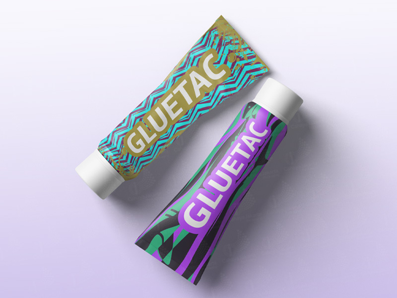
Adding multiple colors, fonts, graphics, and decorative elements may seem like a way to make the packaging stand out. However, too many elements can make the design look cluttered and distract customers from the product’s key message.
When the visual elements compete for attention, it can become harder for customers to recognize the brand and understand the product’s main features.
How to avoid it:
Keep the design focused by choosing a consistent color palette, limiting the number of fonts, and prioritizing the most important information. A clean layout can help you create a more polished appearance while making the product easier to recognize.
2. Choosing Packaging That Does Not Match the Product
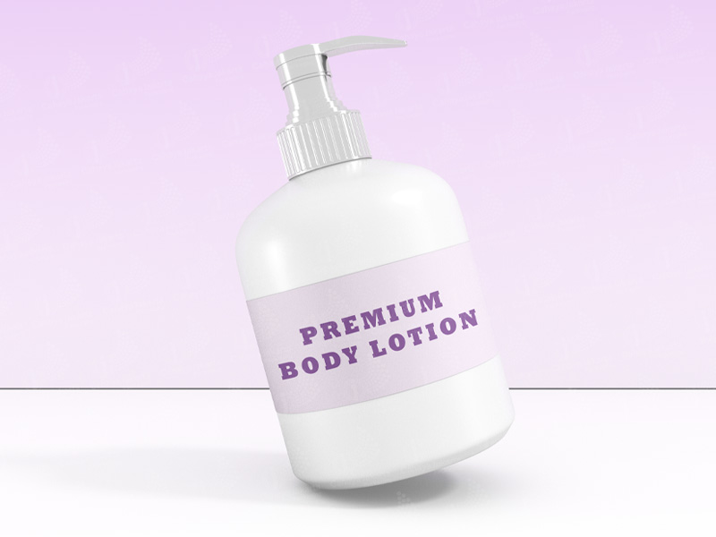
The packaging should reflect the product’s identity and target market. When the material, shape, or overall appearance does not align with the brand’s positioning, the packaging may fail to communicate the quality of the product.
For example, a brand aiming for a premium image may need packaging that feels consistent with its visual identity, rather than simply choosing the most expensive-looking packaging option.
The goal is not to make every product look luxurious, but to ensure that the packaging communicates the right message to its target audience.
How to avoid it:
Consider your target audience, product characteristics, and brand positioning before selecting packaging. The right combination of material, shape, and design should support the product’s identity without compromising functionality.
To learn more about how packaging design influences customers’ perceptions of product quality, read our article on How Packaging Design Influences Product Perception and Consumer Experience.
3. Poor Label Quality and Placement
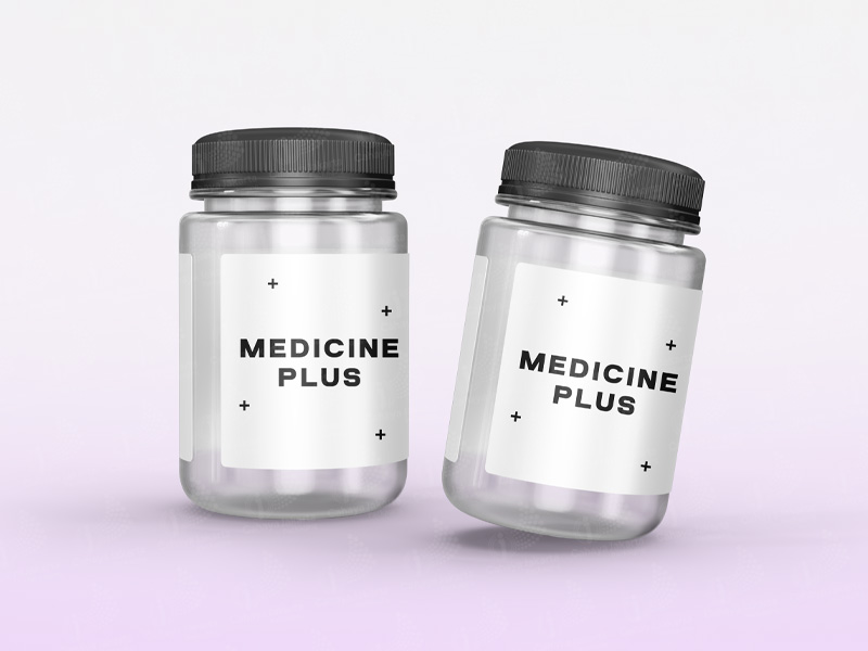
Even a well-designed container can lose its appeal if the label looks misaligned, wrinkled, or inconsistent. Poorly organized text and difficult-to-read product information on a label can also affect the overall product presentation.
These details may seem minor, but they can become more noticeable when the products are displayed together or side by side on market shelves.
How to avoid it:
Choose a labelling solution that suits your packaging shape and material. Pay attention to label placement, text readability, and application consistency to create a more professional result across your products.
For businesses with multiple product variations or high production volumes, selecting suitable labeling methods and equipment can also help support consistent application throughout production.
4. Adding Finishes Without a Clear Purpose
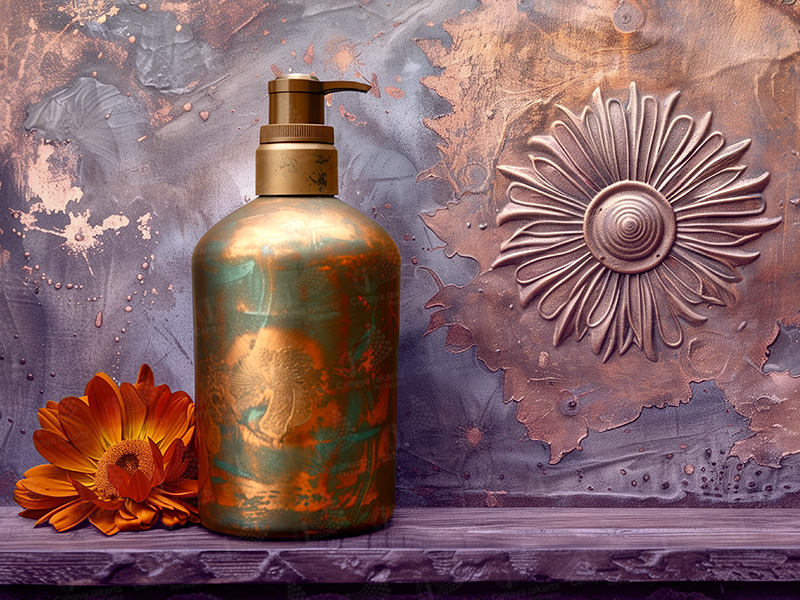
Special finishes, such as metallic accents, glossy surfaces, or textured details, can enhance the packaging appearance. However, using too many decorative elements can make the design look overwhelming rather than sophisticated.
A more expensive finish does not automatically create better product packaging.
When finishes do not complement the overall design, they can distract from the brand identity instead of strengthening it.
How to avoid it:
Select finishes that complement the overall packaging design and brand identity. A single accent sometimes creates a stronger visual impact than overlapping design elements .
Consider how each finish contributes to the intended look, feel, and presentation of the product. The objective is to create a balanced design in which every element serves a clear purpose.
5. Ignoring Consistency Across Product Variations
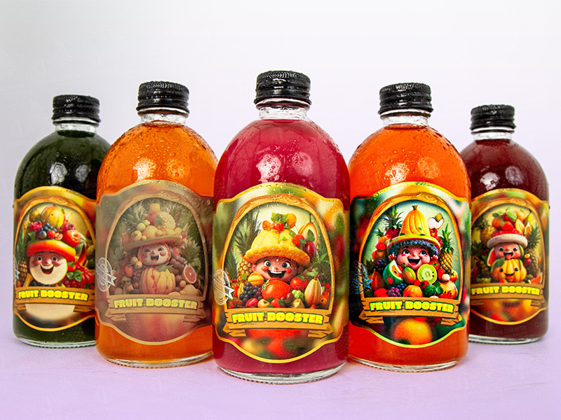
When a brand offers several products or variations, differences in colors, label placement, typography, or packaging styles can make the product range look disconnected.
Consistency is important when products are displayed together because customers should be able to recognize the brand across different items.
How to avoid it:
Create clear packaging guidelines for colors, typography, logo placement, and other visual elements. These guidelines can serve as a reference during production to help you maintain a consistent appearance across different batches and product variations.
For businesses managing multiple SKUs, it is also helpful to establish clear specifications for packaging materials, label positioning, and application requirements. This helps you align the design decisions with production needs.
Create Packaging That Reflects Your Product’s Value
Packaging that looks premium does not always require expensive materials or complicated designs. The right combination of thoughtful design, suitable materials, well-applied labels, and consistent presentation can help products look more polished without unnecessary complexity.
By avoiding these common mistakes, you can create packaging that reflects your product quality and brand identity while building a good impression on customers
At CJ Pack, we offer packaging, labelling, and machinery solutions to support different product and production requirements.From selecting suitable packaging materials and designs to finding the right labelling methods and machinery, we help you explore options that align with your product needs and business goals.
Looking for a way to enhance your product packaging? Schedule a meeting with our team to discuss suitable solutions for your brand through:
WhatsApp: https://wa.me/62811949769
Email: [email protected]


